AndroidFillableLoaders
介绍:
与SVG path一起使用的water填充进度效果。
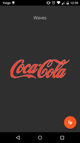
运行效果:
使用说明:
这个库和标准的字符串形式的SVG Path资源一起使用,你需要使用一些其它工具来生成字符串形式的SVG PATH资源。我通常使用GIMP,因为它支持从源图片生成SVG Path。这里是做这个事情需要的文档。
完了之后,把生成的路径设置到view上。注意只取path部分,而不是整个生成的xml内容。path类似于下面的样子:
M 2948.00,18.00
   C 2956.86,18.01 2954.31,18.45 2962.00,19.91
     3009.70,28.94 3043.56,69.15 3043.00,118.00
     3042.94,122.96 3042.06,127.15 3041.25,132.00
     3036.37,161.02 3020.92,184.46 2996.00,200.31
     2976.23,212.88 2959.60,214.26 2937.00,214.00
     2926.91,213.88 2912.06,209.70 2903.00,205.24
     2893.00,200.33 2884.08,194.74 2876.04,186.91
     2848.21,159.81 2839.19,115.93 2853.45,80.00
     2863.41,54.91 2883.01,35.57 2908.00,25.45
     2916.97,21.82 2924.84,20.75 2934.00,18.51
     2938.63,17.79 2943.32,17.99 2948.00,18.00 Z
   M 2870.76,78.00
   ...
用代码设置产生的path:
fillableLoader.setSvgPath(String generatedSvgPath);
把它包含在布局中:
<com.github.jorgecastillo.FillableLoader
  android:id="@+id/fillableLoader"
  android:layout_width="200dp"
  android:layout_height="100dp"
  app:originalWidth="@integer/original_svg_width"
  app:originalHeight="@integer/original_svg_height"
  app:strokeColor="@color/stroke_color"
  app:fillColor="@color/fill_color"
  app:strokeWidth="@dimen/stroke_width"
  app:strokeDrawingDuration="@integer/stroke_drawing_duration"
  app:fillDuration="@integer/fill_duration"
  app:clippingTransform="waves"
  />
  <!--
  Default supported clipping transforms: "plain", "spikes", "rounded" and "waves".
  Read "Customize filling" section to implement a custom one.
  -->ax
如果你更喜欢用代码来实现,可以使用FillableLoaderBuilder类。它会自动的附加到给定的父view。使用LayoutParams参数来设置其位置:
FillableLoaderBuilder loaderBuilder = new FillableLoaderBuilder();
fillableLoader = loaderBuilder
    .parentView((FrameLayout) rootView)
    .layoutParams(params)
    .svgPath(Paths.JOB_AND_TALENT)
    .originalDimensions(970, 970)
    .strokeWidth(strokeWidth)
    .strokeColor(Color.parseColor("#1c9ade"))
    .fillColor(Color.parseColor("#1c9ade"))
    .strokeDrawingDuration(2000)
    .fillDuration(5000)
    .clippingTransform(new PlainClippingTransform())
    .build();
唯一没有默认值的参数是original dimension以及svg path。
自定义填充
To get a custom "top border" style for the filling figure, you can implement the ClippingTransforminterface, which will force you to create an implementation for the transform() method.
You must think about the clipping figure as an invisible polygon that is going to clip your filling figure. (Like a DIFFERENCE operation between the total filling space and the custom transform figure you are applying). It must vary depending on the currentFillPhase.
要为填充特性获得一个自定义的“顶部边缘”样式,你可以实现ClippingTransforminterface,它将强制你去实现transform() 方法。
public class PlainClippingTransform implements ClippingTransform {
  @Override public void transform(Canvas canvas, float currentFillPhase, View view) {
    canvas.clipRect(0, (view.getBottom() - view.getTop()) * (1f - currentFillPhase),
        view.getRight(), view.getBottom());
  }
}
The canvas would be the one used to draw the loader, the currentFillPhase argument is the current percent of the animation step (from 0 to 1), and the view would need to be provided too, so it can be used to create an animation based on view properties, like its current dimensions.
自定义行为
If your loader / brand logo needs to you can suppress the stroke drawing animation and go directly for the filling one. To do that, just set app:strokeDrawingDuration="0".
添加到项目
如果你使用的是gradle,在build.gradle中添加依赖:
dependencies{
    compile 'com.github.jorgecastilloprz:fillableloaders:1.01@aar'
}
如果是maven,添加到 pom.xml中:
<dependency>
    <groupId>com.github.jorgecastilloprz</groupId>
    <artifactId>fillableloaders</artifactId>
    <version>1.01</version>
    <type>aar</type>
</dependency>